Case studies
Product manager with 3+ years of experience, most of it in B2B. Right now I run retention for an edtech program in 500 plus schools across 8 Indian states.
Airtribe coursework
Seven case studies from the Airtribe AI First Product Management program. Each one opens with what the product is, so you can follow it without knowing the company.
Work that shipped, and one capstone.
About
Haniya Amjad
Product manager with 3+ years of experience, most of it in B2B. Right now I run retention for an edtech program in 500 plus schools across 8 Indian states.

How I work
I read an industry fast, reduce a problem to what must be true, and weigh what users need against what the business needs before deciding.
- 01 Read the industry fast Market, money, and who pays for what
- 02 Decode first principles Strip the problem to what must be true
- 03 Balance user and business Experience that grows the business
What this stands on
Work experience
Assistant Product Manager, a skill development company · edtech
May 2024 to Present · Chennai · an edtech program in 500 plus schools across 8 states
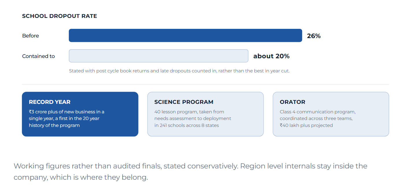
- Own retention across 8 states. Contained school dropout from 26% to about 20%, with ₹1.4 crore at risk, and drove a record ₹3 crore plus year of new business, a first in the program's 20 year history
- Took a 40 lesson science curriculum program from needs assessment to deployment in 241 schools
- Run a feedback system covering 1,200 plus teachers and 80% plus of partner schools
- Build the dashboards leadership reviews run on, tracking dropout exposure, a ₹54.5 lakh upsell pipeline and 97% plus collection efficiency
- Coordinated the end to end launch of Orator, a Class 4 communication program, with ₹40 lakh plus projected from 100 schools
Product and Marketing Lead, Pear Diamonds
December 2023 to April 2024 · Chennai · contract
- Built the brand strategy, business model and go to market architecture from scratch for an early stage venture
- Turned feasibility studies, competitive positioning and segmentation into pricing and product strategy
Lead, Operations and Compliance, deposit taking NBFC
February 2022 to September 2023 · Chennai · NBFC
- Owned RBI and MCA regulatory compliance, and reviewed data, risk and credit policies
- Managed operations, budgeting and planning, and produced the business intelligence reports senior management decided from
Assistant Lead, Growth, SAWO Labs
June 2021 to November 2021 · Bengaluru · seed stage SaaS
- Defined a unified KPI and alignment framework across 5 departments
- Conducted market research and revamped the partnership strategy across 25 plus platforms
Social development and volunteering
Jagriti Yatra, G20 edition
November 2023 · winner, BGT award for innovation in education
- Selected for a 15 day, 8,000 kilometre train journey engaging grassroots enterprises across Tier 2 and Tier 3 districts
- Researched gaps in education access with village communities and structured the findings into an enterprise model
- Won the Biz Gyan Tree award for innovation in education among 500 plus participants nationwide
Program Manager, U&I Trust
2019 to 2022 · volunteer
- Led 35 learning centre leaders delivering after school education to underserved children
- Raised ₹50 lakh plus in funding and designed student level learning outcome metrics
- The centre won the best performing centre award
Education
Post Graduate Program in Management, Finance
Great Lakes Institute of Management · 2025
- GPA 3.46 of 4
BA Economics
M.O.P Vaishnav College for Women · 2021
- GPA 8.66 of 10
- Best research article award for a case study on India's rural urban divide using randomised controlled trials
- President of the ARTH Economics Association
AI First Product Management, Airtribe
Airtribe
- Topics covered: product thinking, user research, problem framing, UX evaluation, PRD writing, product communication, metrics and analytics, growth and prioritisation
- A capstone spanning all of it, published on this site with a working prototype
What I work with
Program design and execution, stakeholder mapping, research and data analysis, root cause and demographic studies, progress reporting, and cross functional project management.
Closing the average order value gap
Zepto sits ₹157 behind the category leader on the size of an average order. The cause is a stretch of the price range in which the app gives a shopper no reason to add anything more.
Product
What Zepto is
Zepto is a grocery delivery app in India that promises to deliver in ten minutes. A shopper adds milk, vegetables or shampoo to a cart and a rider brings it from a small neighbourhood warehouse, with no shop to walk into and no delivery slot to pick. The category is called quick commerce, and the two competitors are Blinkit, owned by Zomato, and Instamart, owned by Swiggy. This case is about average order value, the rupee value of a typical order, which matters because every delivery costs about the same to pick, pack and ride out no matter what is in the bag.
Case at a glance
The gap, and the four steps to closing it
Problem
Baskets are small, and staying small
Zepto’s average order value has stayed flat while both competitors grew theirs. The app is not short of users or orders. It is short of a second item.
- Home, search and cart are all built to reach checkout quickly, which is correct for a ten minute promise.
- The side effect is that once a shopper finds what they came for, nothing asks them to continue.
- The session ends where the urgent need ended.
Approach
What we did to find the cause
- What competitors publish. Instamart credits a 14% quarterly rise in average order value directly to Maxxsaver, its basket building feature. That is close to a stated answer.
- A survey of 30 shoppers across Pune, Bengaluru, Chennai and Mumbai. Midpoint basket ₹414, which confirmed the gap is structural rather than seasonal.
Infographic · Category scoreboard
Where Zepto sits, and what the other two do differently
The survey agreed on three things.
- The free delivery line is treated as a finish line. 63% stop at or near it, and 40% stop after a single item.
- Discovery is too generic to pull anyone sideways. 43% said they rarely try a new category.
- The forgotten item only surfaces after payment, when the app has already closed the order.
Grouping the responses gave five behavioural segments. Three of them, together 67% of the sample, already respond to basket building offers. The highest spending segment does almost no browsing beyond what it already buys, so discovery is the limit on Zepto’s best shoppers, not loyalty.
The diagnosis
Plotting where Zepto rewards a shopper against where orders actually land makes the cause visible. There is an incentive at ₹149 and the next at ₹1,000, with nothing in between. Almost every order lands in that gap.
Infographic · The core diagnosis
The dead zone
The top rail is the structure today. The bottom rail is the proposed ladder on the same scale.
Browsing for longer works against the ten minute promise, so the question becomes how to deepen a basket without breaking it.
Solution
Five mechanics, each removing one blocker
| Mechanic | Blocker it removes | Effort | Priority |
|---|---|---|---|
| Basket ladder Visible next reward at ₹299, ₹499 and ₹799 |
No reason to add a second item | Medium | Must have |
| Cart nudges You are ₹46 from the next slab |
Shopper cannot see how close they are | Low | Must have |
| Bought together Complements from the same dark store |
Discovery too generic to be useful | Medium | Should have |
| Post order window Add to the same delivery for a few minutes |
Forgotten item surfaces too late | High | Should have |
| Restock reminders Timed to a household’s own cycle |
Repeat items rebought one at a time | Medium | Could have |
The basket ladder ships first, not because it scores best but because the other four point at it. Nudges, discovery and recovery all need a visible next step to exist before they have anything to say.
No dark patterns and no invented urgency. Scarcity messaging is used only where a real event backs it, because a shopper in this category who catches the app being untruthful once has almost no cost to switching.
Prototype
What the app looks like once this ships
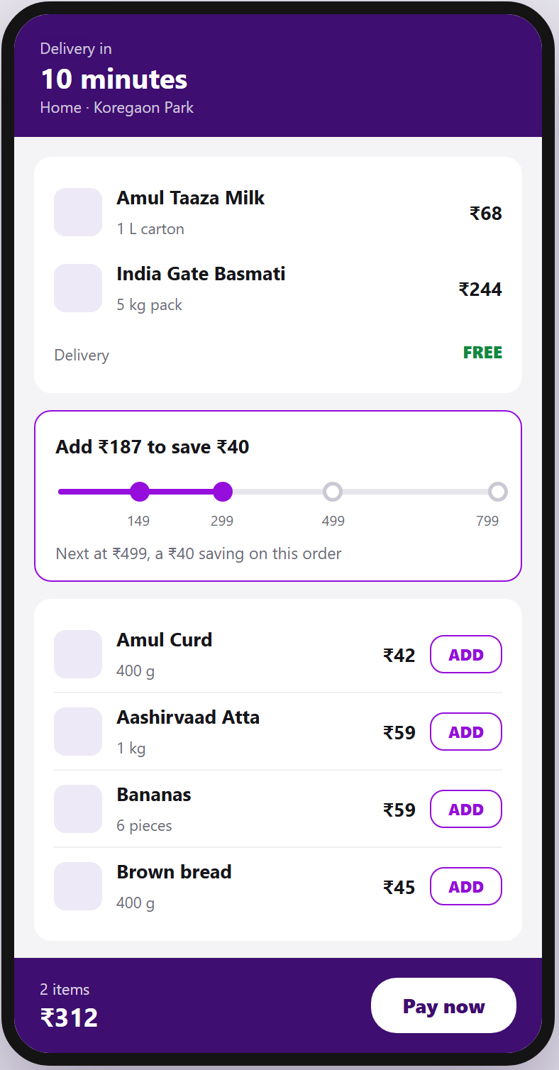
The same cart, the same two items, the same ₹312. The only thing that changes is whether the screen gives the shopper somewhere to go next.
Prototype · Screen flow
Before, after, and the two new moments
Screen one is the cart today. Screen two is the same cart with the ladder in the empty slot. Screens three and four are the moments the ladder makes possible.
Execution
How this would actually ship
The ladder is a pricing and operations change before it is a screen, so the order of work is set by what has to be true before the interface can promise a reward honestly.
Set the slabs against real margin
Finance and the category team fix the reward at each slab so a bigger basket is worth more than the discount that produced it. Nothing else is safe to build until this is settled.
Weeks 1 to 2Check the dark stores can carry it
Operations confirm the complements the ladder points at are stocked in the same dark store. Otherwise the app recommends things it cannot deliver in ten minutes.
Weeks 1 to 3Build the ladder and the cart nudge together
One sprint. Both read the same piece of state, the distance from the basket to the next slab, so splitting them across releases would mean building it twice.
Weeks 3 to 6Run the segment matched test
Three cities, exposure split inside each behavioural segment. Two weeks to read, guardrails checked daily.
Weeks 6 to 8Decide, then queue the rest
Ship, hold or kill on the numbers below. The remaining four are only worth building on top of a ladder that has already proved it moves a basket.
Week 9Metrics
Three numbers, two guardrails
Baskets range from ₹311 to ₹575 across the five segments, so a random split would let segment mix look like a treatment effect. Exposure is split inside each segment instead.
| What we watch | Why it is on the list | Line |
|---|---|---|
| Average order value Primary |
The number the whole case is about | Ship on +₹30 |
| Orders per user per week Guardrail |
A bigger basket must not come from fewer orders | No drop |
| Delivery time Guardrail |
A bigger basket takes longer to pick | Under 10 min |
| Slab completion rate Diagnostic |
Tells us whether the ladder itself is the thing working | Read only |
Powered to detect a ₹20 lift, ships on ₹30 with no guardrail breach, killed by two consecutive guardrail failures or a negative primary metric at day 14. Phase one target is ₹575 to ₹595.
Conclusion
What this case comes down to
Protect the ten minute promise, but give the shopper a reason to keep building once the first need is met. Zepto leaves 850 rupees of its price range with no reward in it, and the ladder fills that stretch. The category leader is ahead on basket building, not on discounting.
This was submitted as a group assignment. The framing, research synthesis, prioritisation and experiment design shown here are the parts I worked on and can defend in detail.
Why only 12 of 100 Zomato app opens become orders
Per 100 Tier 1 app opens, only 12 end in a delivered order. The leaks above the cart and the leaks below it are different kinds of problem, owned by different teams and fixed by different work.
Product
What Zomato is
Zomato is one of India’s two large food delivery apps. A user browses restaurants near them, orders a meal, and a delivery partner brings it, usually within about half an hour. It is a public company and its main competitor is Swiggy. Tier 1 here means the biggest Indian metros, so Bangalore, Mumbai, Delhi and similar, where the market is already mature and growth has to come from existing users ordering more often rather than from new signups.
Case at a glance
Where the users go, and the four steps of the case
Problem
Which number should a business this size organise a year around?
Zomato is not short of users or awareness, so growth in the abstract is not the interesting question. The question is which single number the company should point a year at, and whether that number can be moved without quietly breaking something else.
The objective
Become the go to weekly meal companion for Tier 1 urban India, in which users discover effortlessly, order in seconds, and receive on time, every single time.
Approach
Three lenses, forced to reconcile
- A funnel shows where users leak inside a single session.
- Cohorts show who leaks over months, and why.
- Objectives and key results tie the two together. The rule I set was that every key result had to trace back to a named funnel leak or a named cohort drop.
Infographic · North star
How the north star decomposes into four key results
If a north star cannot be factored, it cannot be owned. Each factor gets one key result, and retention gets two because habit and quality both feed it.
Infographic · Funnel
Two problems wearing one funnel
Above the line, users are not failing to transact. They are failing to decide. Below it, they have already decided and the job is not to ruin it.
Reading the cohort curves before proposing anything
I classified each retention curve by shape first, because the shape decides whether the right move is to fix onboarding, invest in winning people back, or stop spending on that group entirely. Six cohorts then collapsed into two patterns, which matters because six separate cohort programmes is a roadmap nobody can staff.
Infographic · Curve shapes
Four shapes, four different licences to act
Pattern 1
Make the use case explicit
Low frequency, single orderer and dinner dominant users churn because the app hands them a generic experience built for the median customer. The fix is named, occasion anchored experiences. Weekday lunch, made for one, Friday night, Sunday treat.
Pattern 2
Turn episodic into durable
New users, discount driven users and subscribers all churn at transition moments, so at the end of the honeymoon, the end of the promotion, or the renewal date. The fix is to replace an episodic high with a durable reason to stay.
Solution
One north star, four key results, twelve initiatives
Weekly Active Eaters is the north star because it factors cleanly into all four key results, and each key result points at a specific leak. Both of the biggest drops happen before anyone reaches a cart, so both are decision problems rather than checkout problems.
Prototype · Screen flow
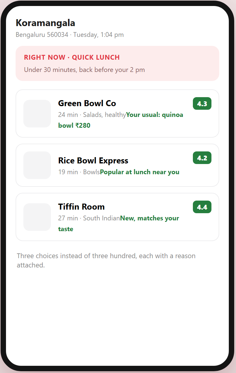
Discovery, the menu, and the delivery nobody had to complain about
The first two screens are the same user at the same moment on a Tuesday at one o'clock.
Execution
How the twelve initiatives get sequenced
Twelve initiatives cannot ship at once. The order is set by which leak is biggest and which experiment can be read cleanly, not by which is easiest to build.
Replace every illustrative baseline with internal data
Every number in this strategy is a public benchmark. Day one of execution is replacing them, because a target set against an industry estimate is not a target.
Weeks 1 to 2Fix the two leaks above the cart first
Discovery and the restaurant page lose the most users and are owned by one team, so they can move without waiting on operations or rider supply.
Weeks 2 to 8Run the delivery stage as three experiments, not one
Predictive arrival time at user level, insulated delivery as a geographic cluster trial, and refund before the complaint at order level. Bundling them would make the result impossible to attribute.
Weeks 4 to 14Ship cohort work only after the funnel work reads
Occasion anchored experiences change the same surfaces the funnel tests are measuring, so launching both together would contaminate each other.
Quarter 2Review notification load across every initiative
Three of the twelve ship into the same push channel. Somebody has to look across them monthly rather than down at one, which is the review nobody schedules.
MonthlyInsulated delivery is randomised by geography rather than by user. A rider carries orders for many users, so randomising per user leaks the treatment into the control group and the result means nothing. Getting this wrong is a common way an experiment programme produces confident nonsense.
Metrics
Six guardrails, because the north star is gameable
Weekly Active Eaters can be bought with discounts, bought with advertising, or extracted from riders and restaurant partners. Each of those wins the metric and loses the business, so each gets a threshold agreed before anything ships.
- Contribution margin per order
- Customer acquisition cost
- Rider earnings per hour
- Restaurant partner churn
- Push notification opt out rate
- App store rating and trust
Notification hygiene is the one to defend hardest. Individually each of the three push based initiatives looks reasonable. Together they can drive an opt out cascade that removes a surface the company cannot buy back.
Conclusion
What this case comes down to
A funnel exposes where users leak in the moment. A cohort exposes who leaks over months. Objectives and key results are the operational answer to both. Every key result here traces back to a named leak or a named drop, and every hypothesis is written as an experiment somebody could run on Monday.
Every baseline is an illustrative public benchmark from investor disclosures and published industry estimates, pending replacement with internal data on the first day of execution. Tier 1 is treated as one market, although Bangalore, Mumbai and Delhi differ materially and a real programme would separate them.
Why Uber pickups fail in the last 200 meters
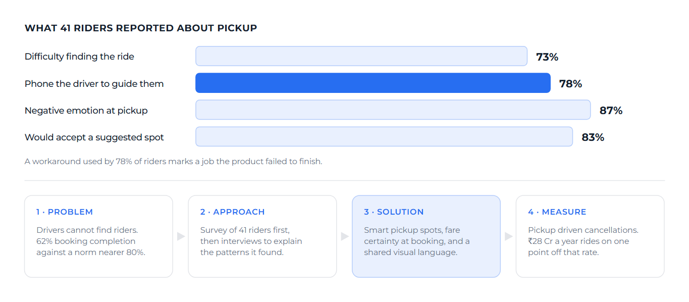
Riders have quietly built a coordination system outside the product. 78% of them phone the driver, because the app cannot reliably close the final stretch between a map pin and a person standing on a street.
Product
What Uber is, and what pickup means here
Uber is a ride hailing app. A rider opens it, drops a pin where they want to be collected, and a nearby driver accepts and comes to get them. In India most of the fleet is autorickshaws and small cars, and the competitors are Ola and Rapido. This case is about the pickup moment, which is the stretch between a driver accepting the ride and the rider actually getting in. It is the one point where the app hands off to the physical world, and handoffs are usually where things break.
Case at a glance
What the research found, and the four steps of the case
Problem
Why I chose this problem
The brief was to find a real user problem and prove with research that it is real. I picked pickup because it sits fully inside Uber’s own product. Traffic, fuel prices and competitor pricing are not controllable. The last 200 meters is.
- Uber India completes roughly 62% of bookings, against an industry norm nearer 80%.
- 82% of riders had a cancellation in the past year.
- A cancellation costs a fare, wastes a driver trip, and leaves a rider one tap from another app.
Approach
Two layers, because numbers and stories fail differently
A survey tells you how often something happens but not how it feels. The survey ran first to establish scale, and interviews ran afterwards to explain what it found.
41 riders. Chennai 66% and Bengaluru 27%. Rapido was the most used app at 46% with Uber second at 29%, which matters because most respondents were describing Uber comparatively rather than as loyalists. Autos accounted for 63% of bookings. Students aged 19 to 24 and professionals aged 25 to 35, across daily commuters and occasional riders.
The most useful question was not about satisfaction. It was what riders do when the driver cannot find them, because the workaround people invent tells you which job the product failed to finish.
Infographic · Observed behaviour
The workaround economy, and where it happens
Every bar on the left is a behaviour the product forced into existence. The venues on the right show it is a physical problem, not a random one.
I usually cancel and use Rapido. By the time Uber is looking for a driver, Rapido confirms.
Ashley, ChennaiFive results that changed what I proposed
| Finding | Why it mattered |
|---|---|
| Extra fare demands are the top pain 37% named it as the one thing to change |
The loudest complaint is a trust violation at the moment of contact rather than a navigation failure, so any pickup fix that ignores it will feel beside the point to a third of riders. |
| 73% face pickup difficulty Only 1 of 41 said never |
This is the normal experience rather than an edge case, which moves it from a support problem to a product problem. |
| Phone calls are the universal fallback 78% of riders |
A call needs a shared language and a describable landmark. For the woman commuting in an unfamiliar city, both of those frequently fail at once. |
| 87% report negative emotions | The functional failure is producing an emotional cost, and an emotional cost is not something a lower fare can offset. |
| 83% would accept a suggested spot 37% yes, 37% conditional, 10% want directions |
The fix does not depend on behaviour change, since 22% already walk to a main road unprompted. It only requires the product to tell them where to stand. |
Four personas, clustered from behaviour rather than demography
About 40%
The budget optimizer
Student, 19 to 24, Chennai. Rapido and autos, price first. Main pain is extra money demands and cancellations at peak hours.
About 30%
The daily commuter
IT professional, 24 to 32, Bengaluru. Uber and Rapido, reliability first. Main pain is tech park gates and drivers unfamiliar with campus layouts.
About 20%
The anxious navigator
Woman, 22 to 35, travelling across unfamiliar cities. Uber and Ola, safety first. Main pain is language barriers, personal safety and GPS drift.
About 10%
The resigned accepter
Infrequent rider, uses whatever is available, expectations already lowered. Main pain is learned helplessness, summarised as this is just how it is.
The resigned accepter should worry a product manager most. They do not complain, do not churn loudly, and never appear in support tickets. They simply stop expecting better, so every satisfaction metric reads acceptably right up until they leave.
Solution
Three proposals, each tied to the finding that justifies it
I held every proposal to one rule. It must cite the specific research finding that makes it necessary, because an idea that cannot name its evidence is only a preference.
| Solution | What it is | Evidence | Estimate |
|---|---|---|---|
| Smart pickup spots Identified meeting points |
Optimal pickup points learned per venue type, so gate level at airports and landmark based inside residential colonies. | 83% acceptance, and 22% already walk to a main road unprompted | ₹50 to 80 Cr |
| Visual pickup navigation AR wayfinding |
A camera based overlay pointing to the driver's exact location, which works without a shared language and removes the phone call. | 78% call the driver, and 87% report negative emotions | ₹40 Cr |
| Fare Shield Extra demand reporting |
One tap reporting when a driver asks for money outside the app, with an instant penalty and a 30 rupee rider credit. | 37% named it the single thing to change, and 17% cancel and switch | ₹30 Cr |
What the journey looks like now, and after
The damage is cumulative. No single stage is catastrophic, but confidence falls at every step until the rider reaches the car already annoyed, which is the state in which a fare dispute becomes a churn event.
Infographic · User journey
Five stages, two very different curves
The lower line is the pickup as riders described it. The upper line is the same journey with the three proposed solutions in place.
Infographic · Street level
Why the driver circles, and what a named spot changes
The rider does not move in either picture. The only thing that changes is whether the product knows where to send the car.
Metrics
What I would measure, and what I would check first
This case stops at research and proposals rather than a build plan, because the next honest step is validation, not engineering.
| What we watch | Why it is on the list | Line |
|---|---|---|
| Pickup driven cancellations Primary |
The point at which frustration becomes lost revenue | ₹28 Cr a point |
| Booking completion rate Primary |
The headline gap to the industry norm | 62 to 75% |
| Driver time at pickup Supporting |
Time reclaimed turns into supply | +2 rides a day |
| Fare dispute rate Guardrail |
The trust failure that sits under the navigation one | No rise |
Before funding any of this I would want a matched read against internal cancellation logs broken down by venue type. That is the data most likely to confirm or kill the smart spot proposal quickly, and it costs nothing to pull.
Conclusion
What this case comes down to
Uber India has a pickup problem that shows up in the numbers as price sensitivity. Several riders said some version of “nothing, just make it cheapest”. I think that reading is wrong. A rider who says cheapest is stating the absence of a reason to pay more, and the product has never reliably delivered the one thing they would pay for, which is the ride arriving where they are standing.
The sample skews 93% South India and over represents Rapido users, so the competitive dynamics described hold most strongly for Chennai and Bengaluru. The market model behind the ₹165 crore figure is worked through separately in the market sizing case.
Why groups abandon Group Order for a WhatsApp poll
Group Order is hired to do three jobs. Coordinate the group, prove the split is fair, and make ordering feel social. It falls short on all three, so groups return to the tool that at least handles the first one.
Product
What Group Order is
Uber Eats is a food delivery app. Group Order is a feature inside it that lets several people add items to one shared cart, so a group can order together and pay once instead of placing separate orders. It exists, it works, and the flow completes. In India its real competitor is not another app. It is a WhatsApp poll, followed by one person paying for everyone and then chasing them for the money, which is free and which everybody already knows how to use.
Case at a glance
The three jobs, and the four steps of the case
Problem
A feature that works, and that nobody hires
The feature ships, the flow completes, and adoption is still low. A feature that functions but is not being hired is failing at the level of the job rather than the level of the build, so I worked backwards from the job instead of forwards from the screen.
Approach
Six anxieties, each one a failed job
Group Order is hired for coordination, trust and social bonding rather than for convenience. Convenience is what a solo order sells. Listing what actually goes through a group’s mind turned the complaint into six specific failures.
| Anxiety | What actually happens | Job it fails |
|---|---|---|
| Coordination overhead | Managing a group order is harder than running a WhatsApp poll. The organiser ends up acting as unpaid tech support. | Functional, Social |
| Payment opacity | Nobody sees their share until the end. There is no live cost ticker and no review step, so there is no basis on which to trust the total. | Functional, Emotional |
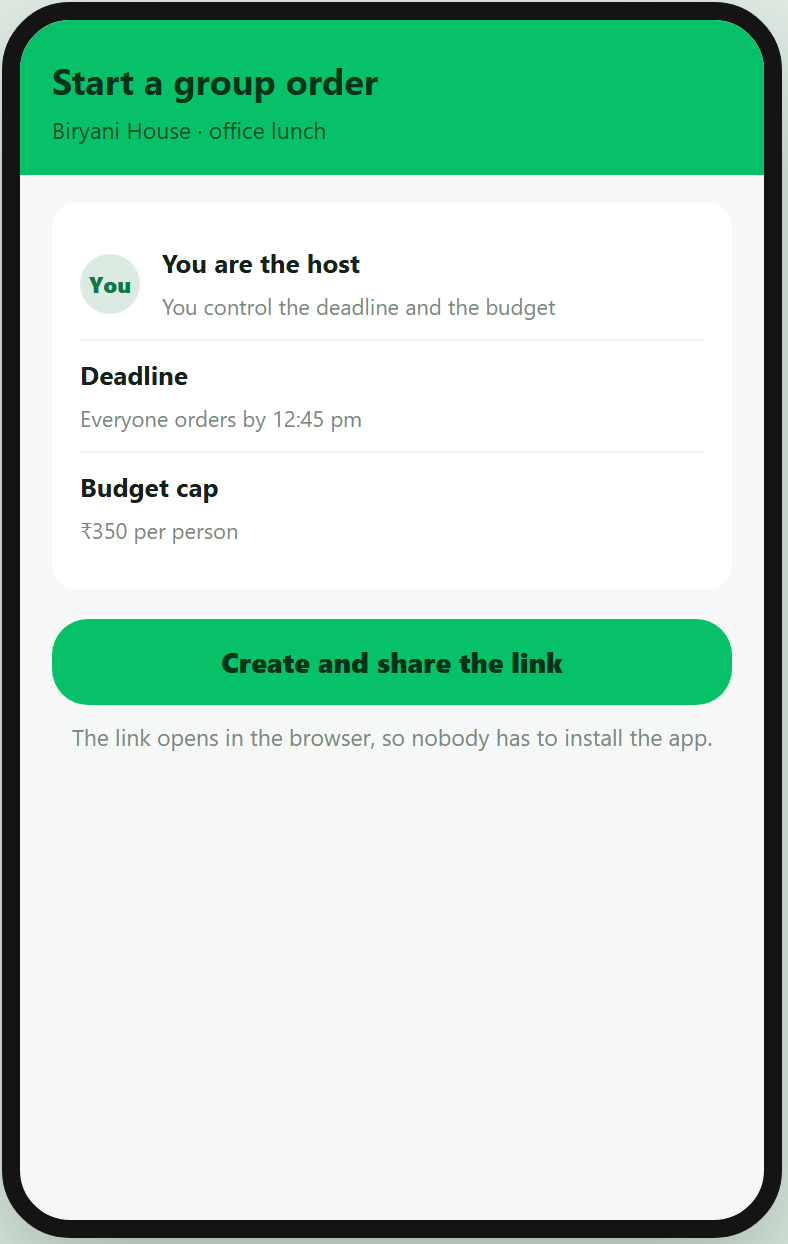
| No host control | Once the link is shared the host loses control. They cannot remove people, set deadlines, or cap budgets. | Emotional, Functional |
| Confirmation gap | There is no clear moment at which the order locks. Participants do not know whether their items made it into the final cart. | Emotional, Functional |
| Analysis paralysis | The order is locked to a single restaurant. Groups with diverse preferences cannot settle on one, so they abandon the attempt. | Functional, Social |
| App dependency | Everyone must have the app installed. In India's fragmented device landscape, this alone limits adoption. | Functional, Social |
From jobs to features, without skipping a step
Most feature lists jump straight from complaint to solution. This chain keeps every feature traceable. It exists because a guarantee requires it, the guarantee exists because a root cause requires it, and the root cause came from interrogating a specific failed job.
Infographic · Product thinking
The logic chain
Read it left to right. Nothing on the right exists unless something on its left required it.
Where the group actually drops out
Mapping the journey from first suggestion through to settling up shows two points where groups give up, and both sit before the food is even ordered.
Infographic · User journey
Six stages, one confidence curve
The curve tracks how confident the group feels at each stage. The two exit markers show where they leave for WhatsApp instead.
The group never reaches the part of the experience Uber Eats is good at. They leave at Join, where the install requirement blocks half the team, and again at Checkout, where nobody can see what they owe. By the time delivery quality or restaurant range matters, they are back in a WhatsApp thread.
Solution
Six features, each delivering a named guarantee
| Feature | What it does | Delivers |
|---|---|---|
| Transparent payment | Live cost ticker, a review step before submitting, and a fair item wise split. | G1 Payment |
| Host control room | A real time view of who joined and who is pending, with a deadline and a budget cap. | G3, G4 |
| App free participation | Web first, so the link opens a browser experience and no install is required. | G2 Delivery |
| Confirmation screens | An order locked state, a summary, and joint ETA tracking. | G3 Confirmation |
| Repeat group orders | Saved groups with weekly auto invite nudges. | G4 Transparency |
| Restaurant democracy | A poll for voting on the restaurant, with an AI recommender for mixed groups. | G5 Privacy |
Execution
Phased by user impact, then by feasibility
The order is set by which guarantee unblocks the others. Nothing downstream matters if half the group cannot get into the cart in the first place.
Infographic · Sequencing
Trust first, then convenience, then delight
Each phase is a precondition for the next, so the order itself carries the argument.
Remove the install requirement
A browser based join link, so a participant can add items without downloading anything. This is the single biggest drop and everything else is downstream of it.
Phase 1Make the split visible before payment
A live per person total that updates as people add items, so nobody is agreeing to an unknown amount. This closes the second drop.
Phase 1Give the host control without exposing anyone
Lock and unlock the cart, extend the timer, and keep individual choices private until the order is placed. Host tools and participant privacy ship together or neither works.
Phase 2Add the social layer last
Reactions, group chat and host recognition are worth building only once the group reliably gets to checkout. Delight on top of a broken coordination flow changes nothing.
Phase 3Metrics
Measure the job, not the feature
Installs and opens would flatter this feature. The numbers that matter are whether a group gets through, and whether they come back.
| What we watch | Why it is on the list | Line |
|---|---|---|
| Join rate Primary |
Share of invited participants who actually add an item | The first drop |
| Group order completion Primary |
Started carts that reach a placed order | The second drop |
| Repeat use within 30 days The real test |
A group that comes back has hired the feature | Pass or fail |
| Host disputes after delivery Guardrail |
Trust in the split is the job, so disputes mean it failed | No rise |
Conclusion
What this case comes down to
The feature was not under built. It was under specified. Nobody had written down what a group order must guarantee, so each release added capability without closing the trust gap that sends groups back to WhatsApp. Five guarantees, derived from first principles, turn an open ended backlog into a pass or fail test.
A ninety second check in that takes five minutes
Garmin Connect holds more accurate data than almost any competitor and presents it worse than most. I walked one everyday flow, logged twelve usability issues across ten heuristics, and rebuilt the interface with every fix applied.
Product
What Garmin Connect is
Garmin makes GPS sports watches for runners, cyclists and swimmers. Garmin Connect is the phone app the watch syncs to, where the wearer reviews their training, sleep, heart rate and recovery each day. The hardware is well regarded and the measurements it collects are more accurate than most rivals. This case is about the app that has to make what they collect readable.
Case at a glance
The four kinds of failure, and the four steps of the case
Problem
The data is right. The reading of it is the product.
The user is a fitness enthusiast who trains four to six times a week on a Forerunner and cares about trends, recovery and personal records. The flow is the one they run every morning. Open the app after a workout, see today, check sleep, review the activity, glance at what is next.
I want to see how I performed today, slept last night, and what is next, without digging through menus.
The user story the flow was evaluated againstFive screens, roughly ninety seconds of intent. In practice it takes far longer, because at almost every step the screen shows a number without saying what it means, how recent it is, or what good would look like.
Approach
What the walkthrough found
Twelve issues, each mapped to the heuristic it violates and the fix it needs. Grouping them into four kinds gives each group a single fix instead of three, which is what makes it a redesign rather than a defect list.
| Law | Verdict | Where it shows up |
|---|---|---|
| Miller's law | Violated | Six metric cards on one screen, brushing the seven plus or minus two working memory limit. |
| Hick's law | Violated | Five navigation tabs, six cards and five home sections together produce decision overload. |
| Goal gradient | Violated | Sleep data eight months stale means there is no current progress feedback toward any goal. |
| Information scent | Weak | Labels like Body Battery and Fitness Age give no preview of what tapping them reveals. |
| Aesthetic usability | Weak | Dense grey on grey cards read as utilitarian next to the polish of Strava or Whoop. |
| Jakob's law | Weak | Platform conventions are broken through the missing calendar legend, inconsistent units and non standard glyph navigation. |
Solution
Six cards become three, and every number gains a meaning
The instinct with a crowded screen is to delete things. That is wrong here, because the data is the reason people buy the watch. The fix is to group it, name it in plain language, and give every number the context that makes it readable at a glance.
Prototype · Before and after
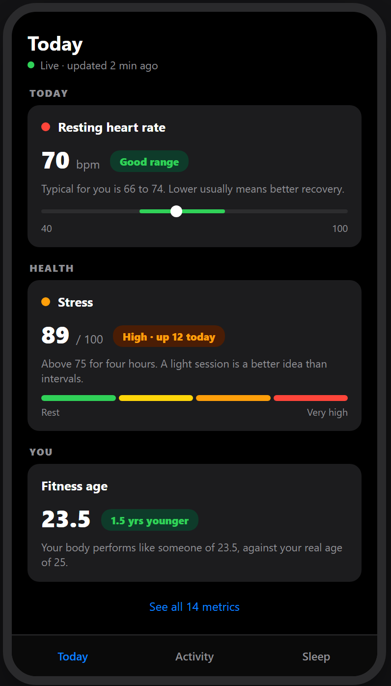
At a Glance, rebuilt as Today
Same data, same dark interface, same brand. What changes is grouping, labelling and scale.
The rest of the flow
The same three rules carry through the other screens. Correct the data before displaying it, never show a value without its scale, and say in words what the colours mean.
Prototype · Screen flow
Activity, sleep and challenges
The first two screens are the same morning. One is what the app logged, the other is what actually happened.
Execution
How this ships without a rebuild
None of these fixes need new sensors or new data. They are display and copy changes on top of what the watch already records, which is why the order below is cheap at the front and only gets expensive at the end.
Fix the wrong data first
One run being auto split into three is a correctness bug, not a design choice. No amount of visual work saves a screen that is reporting a run as a walk.
Backend, firstLabel every number with its range
Stress 89 becomes 89 out of 100, higher is worse. This is a copy and template change with no new data behind it, so it can ship in days.
Copy onlyDate stamp anything that can go stale
A sleep screen defaulting to a range eight months old is only dangerous because nothing says so. Show the range, and default it to the most recent night.
Small changeRegroup the home screen last
Six cards into three is the only change that alters what a long time user recognises, so it ships behind a flag with an opt out, after the cheaper fixes have already improved the flow.
Behind a flagMetrics
Measure the ninety seconds
The user story sets the test. If the flow still takes five minutes, the redesign failed no matter how it looks.
| What we watch | Why it is on the list | Line |
|---|---|---|
| Time to complete the daily check in Primary |
The whole case is that ninety seconds takes five minutes | Under 2 min |
| Screens visited per check in Supporting |
Digging through menus shows up here first | Fewer |
| Support questions asking what a metric means Supporting |
Direct evidence the labels are doing their job | Falling |
| Long time user opt outs of the new home Guardrail |
Regrouping changes what an existing user recognises | Under 5% |
Conclusion
What this case comes down to
A resting heart rate of 70 is a number. Seventy, inside your normal range of 66 to 74, with lower usually meaning better recovery, is an answer, and it fits in the same space. Three rules produced every screen here.
- Correct the data before you display it.
- Never show a value without the scale that makes it readable.
- Say in words what the colours mean, rather than expecting anyone to learn a key that was never provided.
A PRD for members who quietly stop booking
A fitness platform rotates its trainers, so nobody remembers your injury and you explain yourself again every session. Its leaderboards put a 45 year old homemaker against a 25 year old athlete. Both problems have the same effect, which is that people quietly stop booking.
Product
What VitaFit is
VitaFit is a fitness platform where members book classes and personal training sessions, either at a gym or online, and track their progress in an app. It runs on a subscription, so the business depends on people continuing to book after the first month rather than on selling the first month. It sits in the same Indian market as cult.fit, and this case is a requirements document written for the teams that would build the fix.
Case at a glance
The retention gap, and the four steps of the case
Problem
Two failures that produce the same silence
Failure 1
Motivation fades
A single open leaderboard means most people are permanently near the bottom of it. A 45 year old homemaker cannot compete with a 25 year old athlete, so the feature meant to motivate her is the one telling her she does not belong. Progress becomes invisible, and invisible progress stops being pursued.
Failure 2
No bond with a trainer
Trainers rotate, so Trainer A has no idea what Trainer B taught. The user re-explains their injury, their goal and their limits every session. What should be a relationship reads as a transaction, and a transaction has nothing holding it together.
The trainer did not know about my injury. It felt impersonal. I quit after my favourite trainer left. The platform feels too automated.
Customer support verbatims, quoted in the requirements documentThe comparison that made the case internally was Nike Run Club, which holds retention above 80% on streaks and coaching alone. Users are not short of effort. Nothing in the product remembers them between sessions.
Approach
Every competitor owns one dimension, and nobody owns all three
- cult.fit has proven offline community works at scale in India, but its classes are not coach bonded.
- Strava has the stickiest competition mechanics in fitness, but open leaderboards demotivate casual users and there is no trainer layer at all.
- HealthifyMe leads on AI nutrition, but its coach chat is transactional and it runs no events.
Infographic · Competitive gap
Three capabilities, four players
The opportunity is the row nobody has completed, rather than a better version of any one column.
Solution
Two features, written for the teams that have to build them
Feature A
Coach Connect
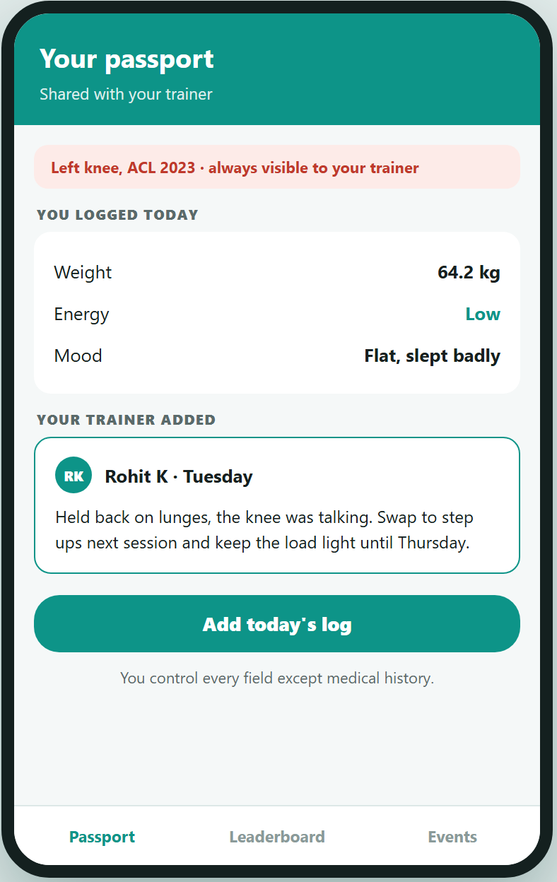
A Fitness Passport that travels with the user across rotating trainers. The user logs meals, weight, mood and energy. The trainer adds session notes and goal adjustments. Medical history is always visible to the trainer, and the user controls every non medical field.
An AI handoff turns recent sessions into a thirty second brief the next trainer reads before walking over, so the coach arrives already informed rather than being replaced.
Feature B
Tribes and Chapters
Sub cohort leaderboards bucket users by age, weight, gender and discipline, so ranking happens against genuine peers. Squad challenges run online through invite links with a live board and a group chat.
Regional chapters run offline, suggested by pin code, covering runs, pickleball and yoga workshops. Completing online sessions unlocks event tickets, and the event produces the photos that pull the next group back online.
Infographic · The mechanism
The hybrid loop
Online is the warm up. Offline is the payoff. The recap is what makes it repeat.
What design and engineering actually build
A requirements document that stops at prose leaves every hard decision to whoever reads it last. These are the four screens that carry the two features, drawn so the team can argue with them.
Prototype · Screen flow
Passport, handoff, fair ranking, and the event
The second screen is the trainer's view. Everything else is the member's.
Execution
Four phases, and the number each one has to move
Phase zero builds nothing. The Fitness Passport runs as a shared document filled in by hand with a handful of power users and their trainers, because if people will not fill it in by hand they will not fill it in inside an app either.
Validate by hand
A manual shared document with selected users and their trainers. No engineering, and the cheapest possible way to find out the idea is wrong.
No buildCoach Connect
Limited rollout behind a feature flag, tested against a control group. Primary metric is weekly repeat session rate.
Flagged rolloutRewards and Tribes
Brand rewards, the share stack, squads, and city chapters in the first metros. This is the phase where the online and offline halves get joined.
First metrosScale
Full rollout, but only on proven improvement from phase 1, opened with a marquee offline event that gives the launch something to be about.
On proof only| Metric | Baseline | Target at 90 days |
|---|---|---|
| Weekly repeat session rate The primary metric for phase 1 | 35% | 50% or better |
| Day 30 retention | 18% | 28% or better |
| Trainer favouriting rate | Under 5% | 25% or better |
| Average sessions per user per week | 1.8 | 2.7 or better |
| Squad participation | 0 | 30% of monthly actives |
| Offline chapter sign up Top three cities | 0 | 8% of monthly actives |
| Trainer notes added per session | Not tracked | 70% or better |
Conclusion
What this case comes down to
Nothing in the product remembers the user between sessions, and nothing gives them a comparison they can win. Content and pricing are not the constraint. Fix memory with a passport that follows them, fix comparison by ranking them against genuine peers, and let the offline chapters carry the habit.
Sizing the pickup problem
Every product proposal eventually meets the question of whether it is worth doing. This is the arithmetic behind a claim of ₹165 crore a year, built two separate ways so the two can be checked against each other.
Product
What is being sized
Ride hailing in India means apps like Uber, Ola and Rapido, where a rider books a car or an autorickshaw from a phone and a nearby driver comes to collect them. This case sizes one specific problem inside that market, which is the money lost when the driver cannot find the rider at pickup. A guesstimate is an estimate built from public figures and stated assumptions rather than from company data, and what it tests is whether every step can be defended.
Case at a glance
The number, and how it was built
Problem
How much money is at stake in fixing pickup?
This estimate sits underneath a research led product case, in which 73% of riders reported difficulty finding their driver and 17% said they cancel and switch app when it happens. The research established the problem is real. This is the separate question of whether it is large enough to fund.
Assumptions
Assumptions stated first, so they can be attacked
The estimate is only as good as these five inputs, so they go before the arithmetic rather than into a footnote.
| Input | Value used | Where it comes from |
|---|---|---|
| India ride hailing market | 8.28 billion dollars | Published market estimate, 11.3% compound growth, 19.2% penetration |
| Exchange rate | ₹84 to the dollar | Assumed. Moves the whole answer proportionally |
| Share of bookings affected | 18% | Anchored on the 17% of surveyed riders who cancel and switch, rounded up slightly for rides that complete but degrade |
| Operator market share | 30% | Assumed for the operator in question |
| Six Tier 1 cities | 55% of bookings | Assumed concentration of demand in the largest metros |
| Recoverable in year one | 8% | The weakest assumption in the chain, and the one the sensitivity below leans on hardest |
Routes
Route one, top down from the market inwards
Infographic · The chain
Five steps from a market to a number you could fund
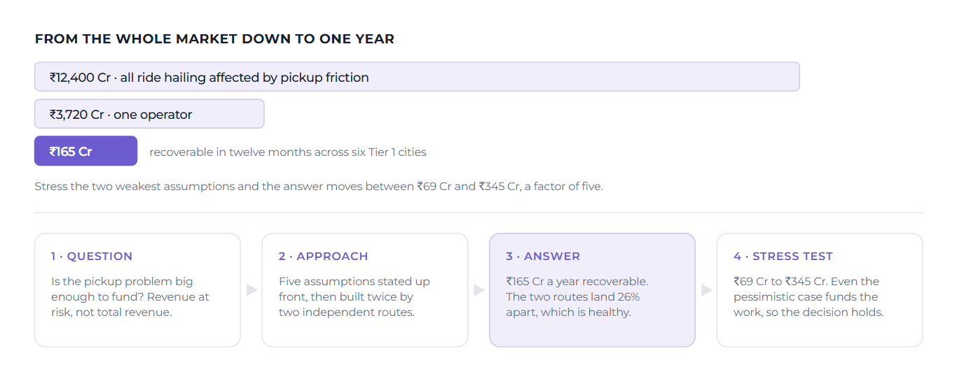
Each step narrows by one stated assumption. Bar widths use a square root scale so the smaller figures stay visible.
Route two, bottom up from rides outwards
The second route never touches the published market figure. It starts from how many rides happen and what one costs, so it can fail independently of the first.
Infographic · Cross check
Two routes, and how far apart they land
Both are estimating the same thing: annual revenue at risk for one operator.
The bottom up route lands lower, which is expected, since the average fare of ₹180 reflects an auto heavy mix while the published market figure includes higher value segments. The two disagreeing by a quarter is useful information. Two routes agreeing exactly would suggest one was quietly derived from the other.
Stress test
What the answer looks like when the assumptions are wrong
A single number invites false confidence. Flexing the two weakest inputs, the share of bookings affected and the share recoverable in year one, produces a range rather than a point.
Infographic · Sensitivity
The honest range is a factor of five
What matters is whether the decision changes across the plausible range. Here it does not, because even the pessimistic case comfortably funds the work, so the argument can move on from whether to build to what to build first.
Conclusion
What this case comes down to
A guesstimate is a structured argument with every joint exposed, so anyone who disagrees can point at the specific assumption they would change rather than rejecting the conclusion wholesale. Three habits carry it.
- State the inputs before the arithmetic.
- Build it twice, by routes that can fail independently.
- Publish the range rather than the point.
Every figure here is built from published market estimates and a survey of 41 riders, not from any operator’s internal data. The headline results come from the original analysis. The step by step derivation, the bottom up cross check and the sensitivity range were reconstructed to show the method, so treat the working as an illustration of how the number can be defended rather than as a company forecast.
Product development
Everything else on this site is a case study. This one shipped. Program delivery and retention for the program across 500 plus partner schools in 8 states, covering the retention turnaround, a record year of new business, and the tooling built to keep the numbers honest.
Problem
A quarter of the schools were leaving every year
The product is a language skill development program running inside 500 plus partner schools across 8 states. When I took over retention, 26% of schools were dropping out annually, which put ₹1.4 crore of revenue at risk and meant field teams spent their year re selling to replacement schools instead of deepening the ones they had.
Nobody knew precisely why schools left, because nobody was asking the schools that had already gone. The renewal conversation happened at renewal time, which is the one moment a school that has decided to leave has no reason to be honest with you.
Approach
Ask the schools that left, then build for the ones that stayed
The same sequence the case studies on this site follow, run for real. Offboarding research with dropped out schools to learn the actual reasons, demographic impact studies across boards and urban rural splits in 7 regions, and region wise work plans built from the evidence. The findings became a retention playbook that leadership adopted, and a multi channel feedback system now covers 1,200 plus teachers, so problems surface while they are still fixable.
Dropout came down from 26% to roughly 20%. I am stating that conservatively rather than quoting the best in year figure, because book returns and late dropouts land after the annual number is first cut, and a retention figure that ignores them flatters itself.
Infographic · The period in numbers
What moved, and what shipped alongside it
Shipped
The record year, and how it was built
New business crossed ₹3 crore in a single year, which had not happened in the 20 years the program has existed. That number was not a sales spike. It came from the same machinery as the retention work: the science program giving existing schools a reason to expand, requirements synthesised from 1,200 plus teacher inputs so the program fit classrooms rather than brochures, and the Orator launch opening a new line with ₹40 lakh plus projected from the first 100 schools.
Science program
A 40 lesson curriculum program taken from needs assessment to live deployment in 241 schools across 8 states.
Orator
A Class 4 communication skills program coordinated end to end across content, design and engineering.
The retention playbook
Offboarding research and demographic studies distilled into a playbook leadership adopted, with a feedback system reaching 80% plus of partner schools.
Results
What the year actually produced
- A record ₹3 crore plus of new business in a single year, the first time in the program's 20 year history
- School dropout contained from 26% to about 20%, with the retention playbook adopted by leadership
- Orator launched as a whole new business line, coordinated across content, design and engineering, with ₹40 lakh plus projected from the first 100 schools
- Monetisation of existing schools worked: a ₹54.5 lakh upsell pipeline built from schools already running the program, at near zero acquisition cost
- Collections held at 97% plus efficiency while the program grew
- One question settled with data: schools giving feedback dropped out at nearly the same rate as schools giving none, so the retention effort moved to where it mattered
From the dashboard I built
The year, in four panels
Redrawn from the internal tool with conservative aggregates only.
Conclusion
The case studies on this site show how I think. This is what happened when it shipped: ask the people who left before guessing why they left, build the program the evidence asks for, and put the numbers where leadership can see them without asking, stated conservatively enough to survive an audit.
Corporate restructuring
The company is an RBI recognised NBFC and one of the first few NBFCs to have a deposit taking licence, founded by a former Executive Director of a national bank. The demise of the founder caused a leadership vacuum, and the pandemic's after effects had severely damaged its books, despite an unshakable dividend declaring legacy of 27 years. I served as Operations and Compliance Lead through the period that followed.
The situation
The severity of the situation
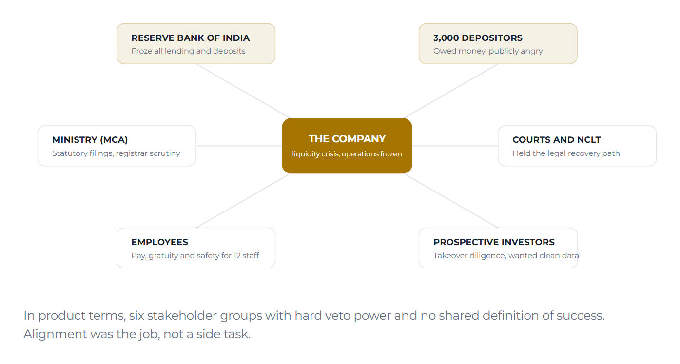
The RBI, owing to the increasing asset liability mismatch, prohibited the company from all operations, offering loans and undertaking deposits. With almost 3,000 customers spread across smaller two tier and three tier cities in two states, the company was amidst a massive public outrage and a psycho social disaster. Depositors of all economic levels of society, from farmers to public servants, threatened legal action, criminal escalations and infrastructural threats to the office premises, endangering the lives of the employees.
In 2021, despite the exponential developments of tech, 30 staff members used steno typewriters, vouchers, manual ledgers and statements for their operations. The records required for any recovery, and for any investor conversation, did not yet exist in a usable form.
Infographic · Severity
Six audiences, each holding a veto
The company sat in the middle. Nothing moved unless all six were managed at once.
The response
The urgency of the response
In response, we prepared for an all branch meeting, wherein we personally met the investors assembled across the branches, explained the unfortunate state of affairs, assured that zero malafide intention and no mismanagement of funds were involved, and established a clear and prompt grievance redressal mechanism for continued customer support and public confidence. Regular and periodic reporting to the Board of Directors ensured transparency and accountability, and the filing of regulator mandated returns was done before time.
Infographic · Urgency
From freeze to phased repayment
What I owned
The role: Operations and Compliance Lead
Grievance redressal and customer support
A prompt grievance redressal mechanism for continued customer support and public confidence. All branch meetings held in person with investors assembled across the branches, with the assurance that zero malafide intention and no mismanagement of funds were involved.
Compliance and regulatory liaison
Main liaison to the RBI and the Ministry of Corporate Affairs, working closely with the Department of Supervision of RBI, the Registrar of Companies of the MCA, and critical organisations of CIBIL and IDBI Trusteeship Services, dealing with authority figures with 40 years of experience in the industry.
Data digitisation and financial reporting
In the head office, with a team of 10, digitised an exhaustive summary of 30 years maintained in ledgers pertaining to loans and deposits, and devised reports on the findings: interest patterns, business expansion, tax liabilities and the RBI's prudential norms.
Operations and budget
Reduced the company size from 30 to 12 in order to cut costs and bring down the monthly operational burn by 36%. Employees were cleared in good faith, with their gratuity corpus maintained externally by LIC as trustee.
Legal strategy and recovery
Worked closely with the legal counselling panel and engaged a former public prosecutor in order to conduct overall legal research and strategy and expedite judgements for the execution of collateral sales and convictions. Worked with resolution professionals and corporate attorneys for the legal takeover of the company via the National Company Law Tribunal.
Investor relations and exit strategy
As part of M&A discussions with prospective investors, analysed the term sheet, credit and risk policy, investment timeline and post merger ownership pattern. Drafted an exit strategy for the company, due to be approved by the Central Bank of India.
Infographic · Proof of work map
The whole engagement on one map
Each crisis condition, the workstream that answered it, and the product skill it built. Read left to right.
Skills
Key skills in product management
Crisis communications and incident response
Personally met the investors assembled across the branches, explained the unfortunate state of affairs, assured that zero malafide intention and no mismanagement of funds were involved, and established a clear and prompt grievance redressal mechanism for continued customer support and public confidence.
Stakeholder management
Main liaison to the RBI and the Ministry of Corporate Affairs. Worked closely with the Department of Supervision of RBI, the Registrar of Companies of the MCA, and critical organisations of CIBIL and IDBI Trusteeship Services, dealing with high stakeholders and authority figures with 40 years of experience in the industry.
Data analysis and financial reporting
Digitised an exhaustive summary of 30 years maintained in ledgers pertaining to loans and deposits, with a team of 10, and devised reports on interest patterns, business expansion, tax liabilities and the RBI's prudential norms. Financial modelling in MS Excel and Power BI dashboards.
Prioritisation and runway management
Reduced the company size from 30 to 12 in order to cut costs and bring the monthly operational burn down by 36%. Employees were cleared in good faith, with their gratuity corpus maintained externally by LIC as trustee.
Cross functional collaboration
Worked closely with the legal counselling panel and a former public prosecutor in order to conduct overall legal research and strategy and expedite judgements for the execution of collateral sales and convictions. Worked with resolution professionals and corporate attorneys for the legal takeover of the company via the National Company Law Tribunal.
Due diligence and negotiation
As part of M&A discussions with prospective investors, analysed the term sheet, credit and risk policy, investment timeline and the post merger ownership pattern, in alignment with the legal standing and recovery of the company.
Sunset planning
Drafted an exit strategy for the company, due to be approved by the Central Bank of India. Partial recovery of the asset book, and phased out repayments done to the public creditors. A relaxation and moratorium was allowed by the Ministry acknowledging the resilience of the team.
Executive communication
Regular and periodic reporting to the Board of Directors to ensure transparency and accountability. Filing of regulator mandated returns done before time.
The anchored week
Only 34% of new cultpass members build a routine in their first 45 days. The app is not missing features. It is missing the thread between them, and the member is currently the only thing joining them up.
Problem
A prepaid promise that quietly cancels itself
cult.fit books revenue the day somebody buys a cultpass, but next year's revenue is decided by whether they show up often enough to renew. That makes the first 45 days the window in which the business is actually won or lost.
The milestone the company tracks is deliberately shaped. Eight workouts in the first 45 days, spread across at least four different weeks. The spread clause is the hard part, because ten workouts crammed into a fortnight still fails. A burst is not a routine. Today only 34% of new members clear it.
Who this is for
New cultpass members aged 25 to 34, in metro cities, with full time desk jobs, either beginners or returning after a gap. They buy on a trigger, usually weight, a health scare, or a feeling that it was time. Then they stall, because they do not know what to do, work eats the evening, and motivation drains without anything noticing.
Approach
Led by the people who watch this happen every day
A survey of current members only ever reaches the ones who stayed. The people I most needed to understand had already stopped opening the app. So the primary channel was not the survey. It was sit down interviews with five senior branch and area managers across six centres in Chennai, who watch first 45 day behaviour every single day and can name it.
Alongside that ran a screened survey of 20 active, paused and lapsed members, community and review mining that reaches the churned voices a survey cannot, and a live audit of 20 app screens.
Six findings, and the ones that mattered came from the field
| Finding | What it means for the product |
|---|---|
| No notification ever worked | Not one of 20 members booked after a push. The Nungambakkam manager goes further, saying alerts actively frustrate beginners into leaving. |
| Beginners barely use the app | A new joiner opens it only to book or log entry. It takes roughly 20 sessions before the app opens up to them, so any solution assuming engagement is dead on arrival. |
| Squad is the one cue that lands | In the two centres with the highest reactivation, the alert people act on is a friend's booking rather than the app's. The mechanism already exists, so the job is routing beginners into it. |
| Dance is the on ramp | Managers agree the fastest way to turn a nervous beginner into a regular is a dance class, because the brain files it as leisure rather than exercise. |
| The trainer is the anchor | Certified trainers carry beginners on posture, reps and load, but most beginners never think to ask and nothing in the product tells them to. |
| Unstable schedules kill routines | Named unprompted, in members' own words, as the reason their friends quit. Timings shift day to day and popular classes book out days ahead. |
What the desk research assumed, and what the field said
This is the part I would defend hardest in a room. Every assumption I walked in with was either wrong or pointed at the wrong layer.
| Desk research assumed | The field said |
|---|---|
| Notifications just need to be smarter. | Notifications are negative. Beginners leave because of them. The issue is relevance, not cleverness, and no amount of modelling fixes a channel people have already learned to ignore. |
| The barrier is the same everywhere. | It differs by city. Over capacity in Bangalore, schedule chaos in Chennai. Only the app side failure is common, which is precisely what scopes a product fix. |
| Beginners engage with the app to learn. | They do not. For around 20 sessions the app is a booking and entry log. The trainer and the squad do the teaching. |
| Rewards and streaks drive the habit. | They already exist and are underused. Squad, meaning a friend turning up, is the real retention engine. |
I went in believing the primary barrier was the miss spiral, in which one missed session cascades into permanent drop off. The survey did not support it, since 7 of 20 reported returning the next day. But fully churned members are unreachable by a survey of current members, so the hypothesis is inconclusive rather than disproven. I demoted it instead of deleting it, and it re enters below as the explicit thing Reserve Session is built to test.
"cult.fit forces you to change your life to their schedule."
A public review, echoing what the managers described independentlyInfographic · Diagnosis
Where the routine actually leaks
Not at signup, and not at the first workout. It leaks the moment the second week has to look like the first.
The real problem
New members attend a first workout and never form a routine, because the app never connects its own features into a guided journey. Booking, plans and tracking ship as islands, so the member is the only integration layer, and intent decays feature by feature into silence.
Choice
Fifteen ideas, pruned to ten, scored down to two
I brainstormed against the barrier rather than against the product, then removed anything cult.fit already ships. What survived was scored on an evidence rubric, in which confidence is set by the quality of the proof behind an idea rather than by how strongly I believed in it.
Infographic · Prioritisation
From fifteen candidates to two bets
The prune is as much of the work as the generation.
| Candidate | R | I | C | E | Score | Basis for the confidence rating |
|---|---|---|---|---|---|---|
| Reserve session | 3 | 4 | 4 | 2 | 24.0 | A working prototype flow exists, so confidence is high. Reaches the members who hit an at risk week. |
| The anchored journey | 5 | 5 | 3 | 4 | 18.8 | Triangulated research. Attacks the primary barrier, and every new member passes through it. |
| Preference capture at signup | 5 | 1 | 3 | 1 | 15.0 | Cheap, but changes nothing alone. A preference nobody acts on is just a form. |
| Smarter push notifications | 5 | 1 | 1 | 3 | 1.7 | Falsified by the field. The evidence does not merely fail to support it, it contradicts it. |
Smarter notifications is the answer most teams ship first. It scores 1.7 here specifically because the confidence term is doing its job. A rubric that cannot produce that result is a rubric that only ratifies what you already wanted to build.
Solutions
One builds the week. The other protects it.
Neither bet asks for new centres, new trainers or new supply. Both are orchestration of surfaces cult.fit already ships, which is what makes them credible inside a fixed cost business.
Bet 1
The anchored journey
A forty second day zero setup captures four things: preferred slots, comfort level, a micro goal in the member's own words, and how they want to feel afterwards. The journey then leans on those for 45 days.
It sequences what already exists. A class preview before a first time format, one meal suggestion after a hard session, streaks re skinned as weeks kept rather than day counters, progress read against the member's own goal, and an identity arc from Explorer to Regular to Anchored.
The single new idea is drift response. Past day 45 it runs silent until drift: a day 21 recall of why they signed up, a gentler suggestion after a rough session, and complete silence in any week the member is on track.
Bet 2
Reserve session
A lost session never means a lost week. cult.fit's structural advantage, having gym, group class, sport and home under one membership, turned into a rescue ladder that fires when an evening is at risk:
- An express version of tonight's session, same centre
- A different format in the same slot, so dance or yoga instead of the floor
- A sport instead. Badminton, football, pickleball. Different mood, still counts
- A home workout, equipment light, capped once a week
- Shift the time, keep the day. The calendar updates itself
- A same week make up after a miss. One offer within 24 hours, never next Monday
No single format competitor can copy a cross format rescue ladder.
Every drop off archetype is caught by exactly one bet
| Archetype | Caught by | Mechanism |
|---|---|---|
| The never started | Anchored journey | A path replaces the catalogue at onboarding, so the first decision is made for them. |
| The burst and faded | Anchored journey | Comfort matched intensity prevents the week one burnout that follows a session pitched too hard. |
| The sporadic fitter | Reserve session | The at risk evening finally has a fallback that is lighter than the plan and still counts. |
| The week breaker | Reserve session | The same week make up defends the four week spread clause, which is the part of the milestone that fails last. |
Coverage is the point. Two bets, four archetypes, no overlap and no gap. Both of them route into Squad, the accountability mechanism the field identified as the only cue that lands, rather than trying to rebuild it.
Prototype
Four moments that carry the whole argument
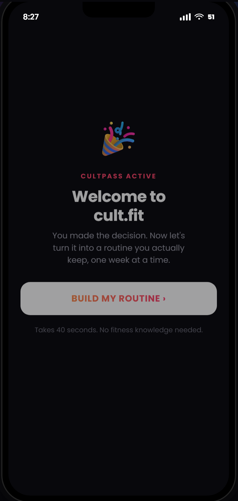
A strategy is only as good as the screen it lands on, so I built it. The version below is drawn to show the mechanics, and the clickable prototype behind the button walks the full flow.
Prototype · Screen flow
Setup, the thread, the rescue, and progress that survives a miss
Metrics
A north star the product cannot game
North star
Weekly Routine Members. Members completing two or more counted workouts a week, in three of the trailing four weeks. It measures the routine and never the app, so opens, sends and impressions cannot move it.
That definition is deliberate. A north star built on app engagement would have rewarded exactly the notification strategy the research falsified. This one only moves when somebody actually trains, repeatedly, across weeks.
Guardrails, each with a trigger agreed before launch
Overtraining
The system must never push somebody into injury to hit a spread target.
Guilt sentiment
Recovery copy has to read as a detour rather than a verdict. Tracked in review language.
Booking health
Rescue offers must not take capacity from members who planned properly.
Gym share
Cross format routing must not hollow out the floor that fixed costs depend on.
What it is worth
Member level economics are labelled assumptions. Revenue per member uses the published annual cultpass price. The model assumes a 70% renewal rate for activated members against 40% for stalled ones, and is sensitivity tested at 65 and 50. These are case figures rather than company data, and the 70 to 40 split is the first thing the earliest cohort is instrumented to test.
What next
Written down before launch, with the kill criteria attached
Rollout is gated across five cohorts. Demand tests run before any production code, each cohort opens only when the previous one clears its gate, and any guardrail breach pauses and rolls back rather than pressing on.
| Open question | Why it matters | The experiment that answers it |
|---|---|---|
| Does the renewal split hold? | The 70 to 40 assumption is the spine of the entire business case. | The first two cohorts are instrumented for it. Kill criterion is a gap below 10 points. |
| Does day zero setup complete? | If members will not finish forty seconds, nothing downstream exists. | A demand test in the first cohort, before a line of production code. |
A strategy is what I have decided to test, in what order, and what evidence would make me stop. Belief does not come into it.
Which is why this list was written before launch rather than afterConclusion
cult.fit already ships every tool a routine needs. Booking, plans, tracking, squads, every format under one pass. What it does not ship is the thread between them, which means the member has to be their own product manager for 45 days. The anchored journey builds the week and reserve session protects it, and neither one asks the business for a single new thing to sell.